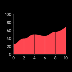
Area chart stacked

Stacked area graph
This is similar to an area chart, but different colours are stacked on top of each other to show parts of a whole.
Limit to four or five categories to make the visualisation clear. Order your categories strategically, placing the most important ones at the bottom. Make sure that categories are easily distinguishable by using colours and labels.
1. To illustrate investors' evolving priorities towards different asset classes (e.g. stocks, bonds, real estate) over the past decade.
2. To show the shifting priorities of business leaders towards ESG issues over time.
Which digital transformation initiatives have you prioritised in the past three years?
Date/Time response, Numerical response, Ranking question, Rating scale, Single mention
Alternative charts