


Area chart
Area graph
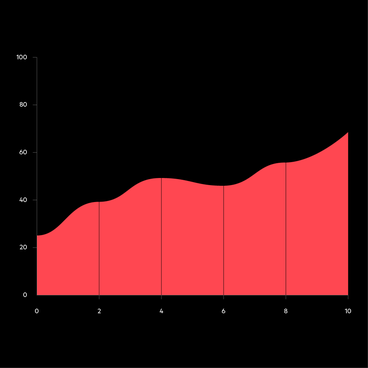
This is like a line chart, but the area below the line is filled with colour or a gradient to show volume. Area charts are often used to tell a story about trends over time rather than about specific values.
Focus on illustrating trends or cumulative changes over time rather than on individual values. Use colour sparingly to maintain clarity. Clearly label axes with the time period and units of measurement. Don't use for discrete data or if negative values are important.
1. To show the growth of investment in renewable energy over time.
2. To visualise a growth in website traffic.
How has your organisation's travel budget changed over the past year?
Date/Time response, Multiple mention, Numerical response, Ranking question, Rating scale, Single mention
Alternative charts
